BenUlcoq.github.io
CAB-T1A3 Portfolio
Published URL
Repo Link:
GitHub - BenUlcoq/BenUlcoq.github.io: Repo for my portfolio website
Purpose
The purpose of this project was to design and create a portfolio website that advertises and showcases my skills as a full-stack developer to potential employers. The project was to satisfy the brief and criteria of the third assignment of term one at Coder Academy Brisbane’s Fast Track bootcamp in order to demonstrate skills and understanding relating to modern HTML5, CSS3, source control and UI/UX design techniques.
Functionality/Features
The portfolio website was built using mobile-first techniques to ensure that a wide range of users could have the best possible experience with the site. Thanks to the power of Flexbox and Grid, the website required very few media queries to port from mobile layout to the larger tablet and desktop screens.
Sub-resource Integrity was used to make the website as secure as possible using both sha512 and sha384 hashes.
Components
A number of components were designed to improve the user interactions with the site:
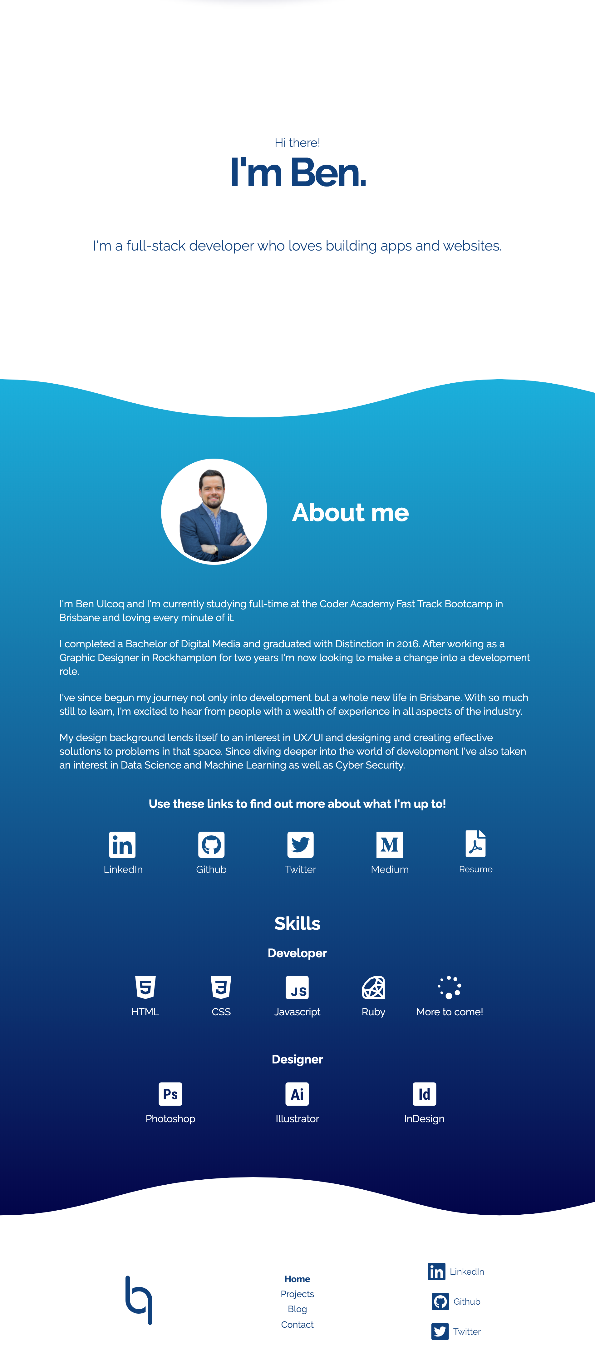
- Landing Section for welcoming the user to the site.
- About Section containing text and other content regarding my interests and skills.
- Icons Section - links to my various accounts and resume.
- Skillset Section identifying some of my professional skills.
- Header - Site Navigation bar
- Footer - Alternative navigation bar.
- Cards containing information about past projects and blogs.
- Contact Form - A form for users to contact me.
- Wave Graphical Elements - A repeating element that enhances the visual style of the site.
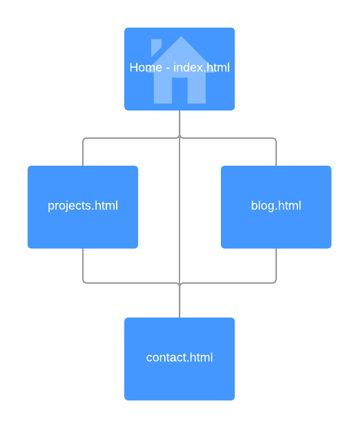
Sitemap
The website contains four pages all linked together, with the contact page also being accessible through the other pages as a popup.
Screenshots
Additional Screenshots of various pages and interactions can be found in /docs/screenshots.
Target Audience
The target audience for this project was prospective employers looking for full-stack developers. As such, the design of the UI and UX could be adjusted to reflect prior knowledge.
Tech Stack
- HTML5
- SCSS
-
jQuery
- Figma - Concepting
- InVision - Wireframing
- Font Awesome - Icons
- Icons8 - Icons
- Google Fonts - Webfonts
- Pexels - Stock Photography
- Github - Source Control
- Github Pages - Deployment
- Lucidchart - Sitemap
Design and Development Process
The design and development process was broken down into clearly defined stages in order to provide the best chance at delivering a product that clearly satisfied all aspects of the brief, while still being an asset that I could use in the future to advertise myself and my skills.
Brief Analysis and Goal Setting
Before I made any progress towards building my website, I made sure that I had a full understanding of the brief and how that would translate into goals for the website, which would drive the design.
Ultimately, I decided to create the following four pages which I could design to satisfy other criteria fulfil the purpose of the project.
- index.html - a home page which also functions as a profile page.
- projects.html - a place where I could showcase my past work.
- blog.html - A list of blog posts that I have written
- contact.html - A way for people to get in touch with me.
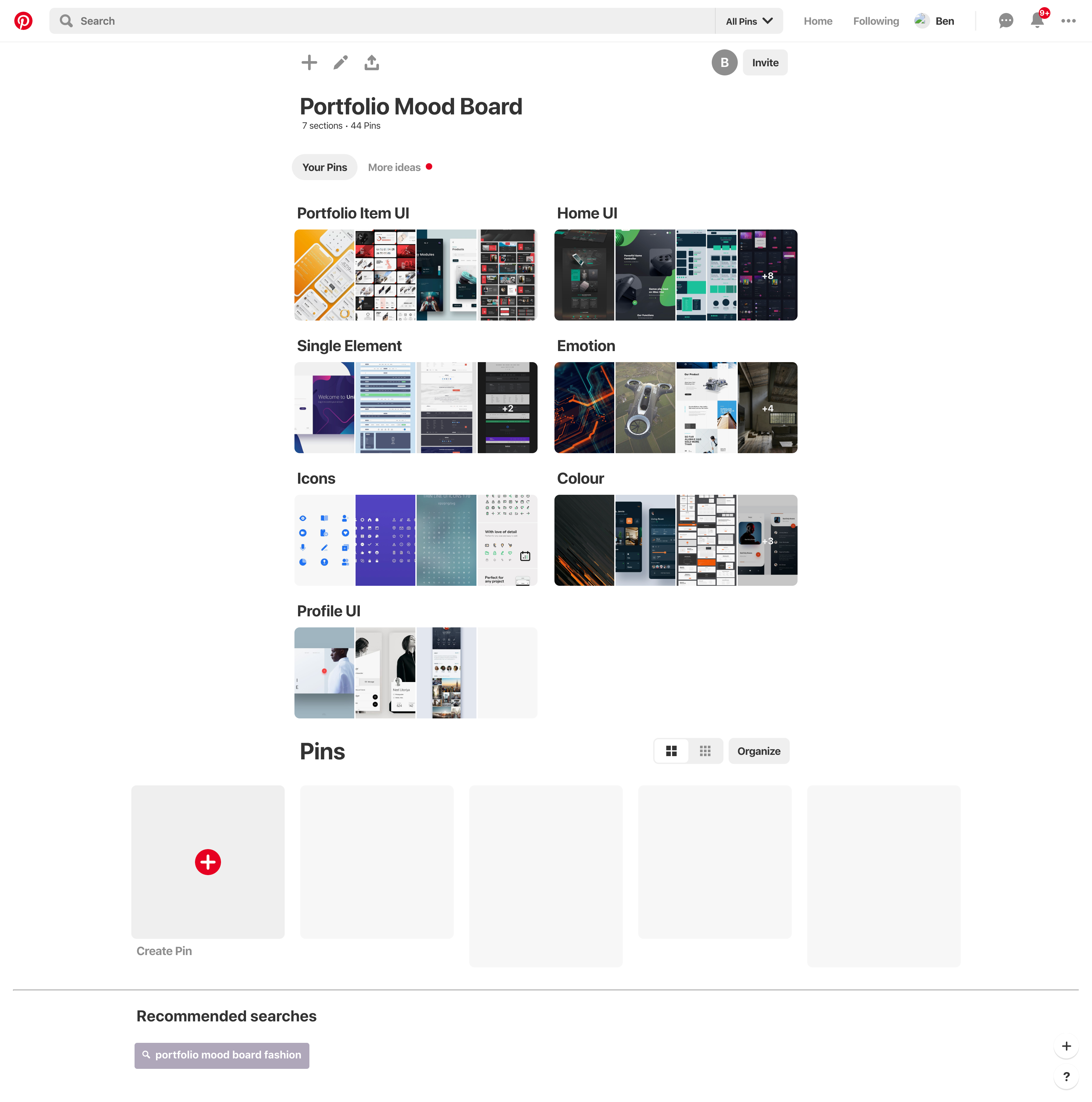
Research and Mood boarding
The first step in the design process was to conduct research and define a clear direction for the process by way of creating a mood board.
The primary resource used for this process was Pinterest. Pinterest provides a perfect platform for researching trends, finding inspiration and collating everything in a simple to navigate location.
The mood board created was broken down into a number of smaller sections that reflected various parts of the project. These included:
- Portfolio Item UI - inspiration for collections of elements.
- Home UI - inspiration for the home/welcome page.
- Profile UI - inspiration for profile page designs.
- Single Elements - inspiration relating to certain elements within the website.
- Icons - inspiration for icons that I may use on the website.
- Colour - colour palettes that I might use.
- Emotion - Various items that elicit emotions I hoped to recreate with my website.
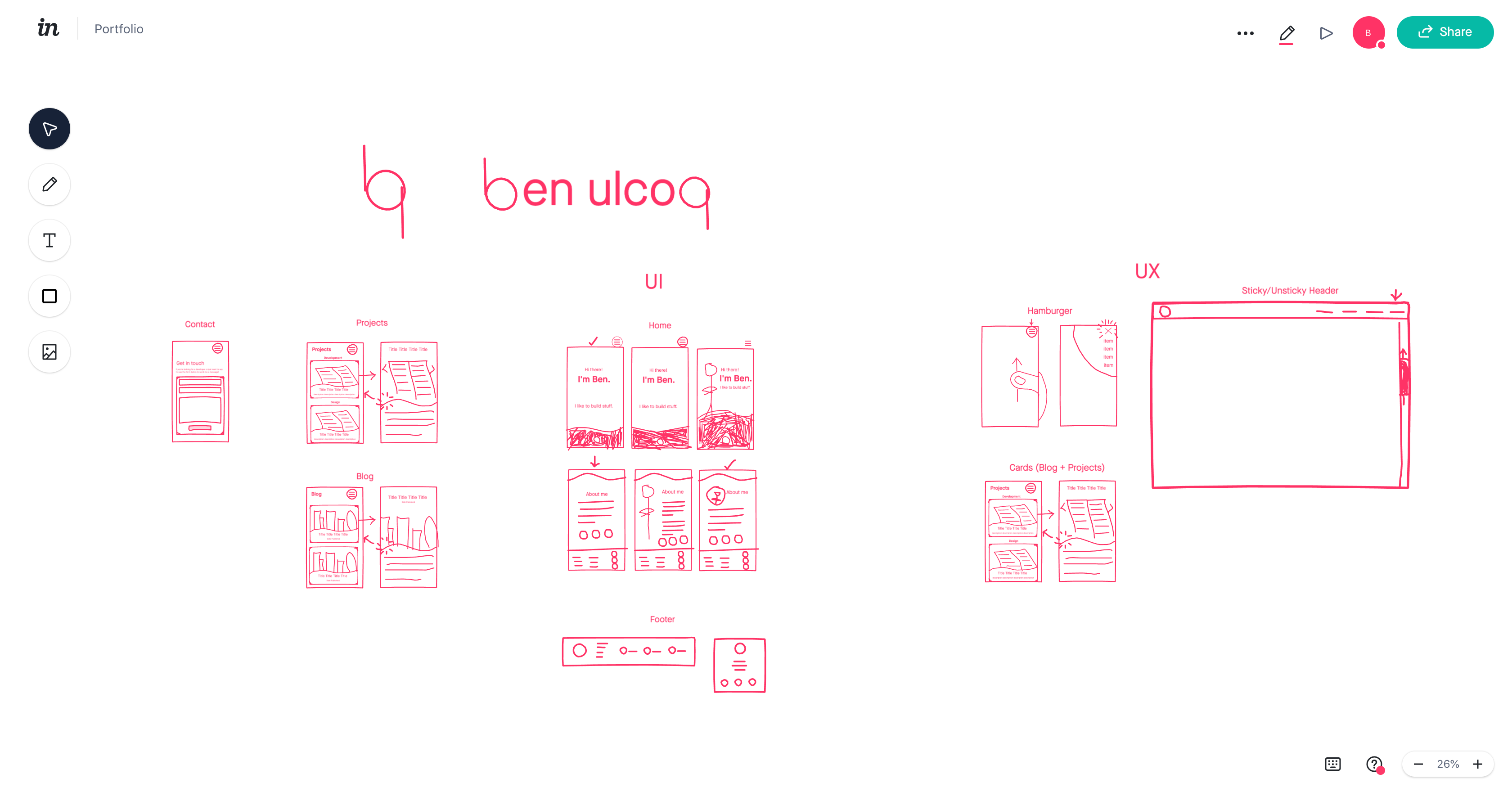
Wire-framing and Concepting
Once I had found a selection of items that I thought would provide a strong enough foundation for inspiration and guidance I then moved on with designing wireframes and fleshing out concepts for the website which struck a balance between satisfying the design brief, showcasing my skills and providing a platform for advertising myself for employment prospects.
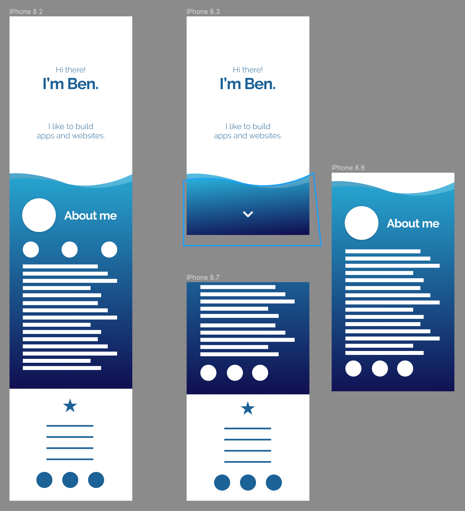
Initially, I made some very rough sketches using InVision. This meant I could quickly explore a wide range of layout ideas in a relatively short amount of time in order to try and find the best design possible.
As it is the entry point to the site, I began by creating rough concepts of the home page. From my mood boarding I knew I wanted the website to appear friendly and personable, yet professional and intriguing so that potential recruiters are drawn in.
I played around with ideas that captured certain parts of this goal until I settled on a design that I felt fit closely with what I was trying to achieve.
From here I fleshed out the homepage concept using Figma to sort out colours and styling and nail down a more refined concept. Once I was happy with the design I jumped back into InVision to work on creating layouts for the remainder of the pages before going back to Figma to flesh them out once again.
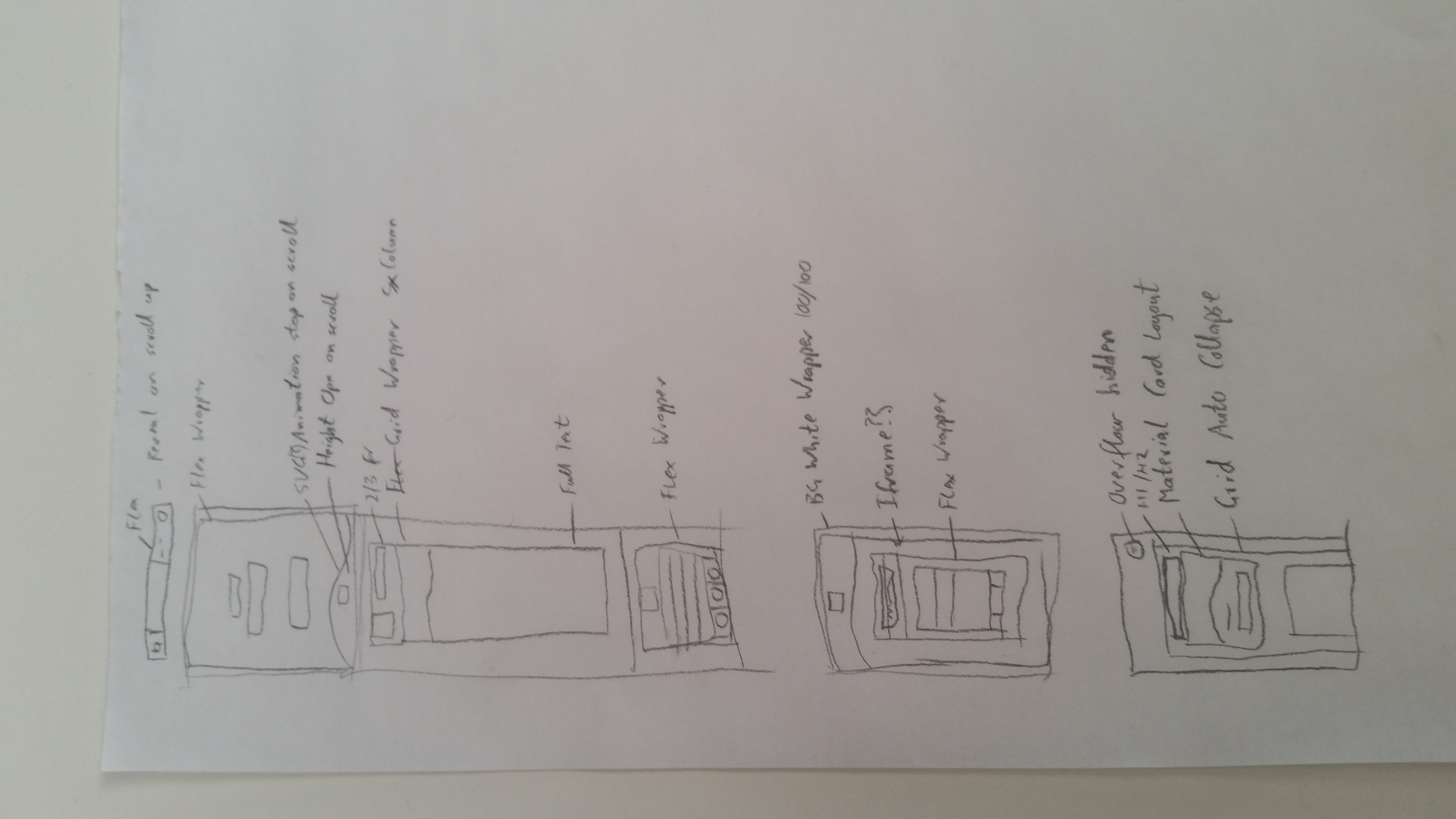
Structuring
Once the concepts were finalised, I laid out a rough plan for the structure of the HTML and CSS which would break out of the ordinary flow of a website and needed a little more thought to implement than a standard element.
This was only a rough idea so that I had an initial direction - there was likely to be changes I needed to make later on when things were or weren’t working.
Development
From here I aimed to implement a skeleton version of the site with only layout elements being positioned on the pages.
This would help with implementing accessible features, clean code and force me to stick to the styling and layout that was designed.
Unfortunately, it didn’t really turn out the way I was hoping. I discovered things weren’t working the way I had planned so I had to do a bit of improvising.
I struggled to visualise the effects my improvisation was having on the whole site so I ended up jumping into styling before completely laying out the site and I think the project suffered for it. My code isn’t particularly clean, the website isn’t as accessible as I believe it should be and the development process was for less efficient if I had stuck to the original plan.
Content Generation and Styling
Outside of the improvisation, the content generation and styling was fairly smooth sailing. The largest problems faced were to do with implementing performance improvements, SEO and accessibility features.
However, the animations were quite tricky to get right. I spent a significant amount of time trying to get the animations working perfectly as I felt it was a core part of the user experience.
Review
Upon review of the website design and source code there were a number of small bugs and improvements that I found and implemented.
The largest area where I failed to reach a level I was happy with was accessibility. The cards I designed are accessible but the functionality is not completely friendly to all users which is a problem. If I had more time I would implement a better solution here. Preferably though, I would like to go back and restart the development process with accessibility higher on the list of priority.
Principles, Components and Engagement
Throughout the design and development process there were some core ideas that drove decision making. These ideas came from the need for my website to be:
- friendly and personable
- and professional and intriguing
As outlined above I explored a range of styles during the sketching phase until I settled on a design that I felt captured these feelings well - specifically, it was a very clean design which appeared very professional, but I avoided any jagged edges to create a sense of welcoming and calm. I also made use of the curves as a repeating element that gave the user a visual indication for elements that had ‘something more hiding under the surface’.
Although I was happy with the styling I had created on the homepage, I felt that it may be heading slightly away from ‘friendly and personable’ and more towards ‘corporate’. I didn’t want to sacrifice the professional and intriguing mood I had captured in my styling, so I sculpted the UX to drive people towards my bio before anything else. This meant that (all going well) users would come to my site, get a ‘professional and intriguing’ sense from the styling, and read my bio - providing a ‘friendly and personable’ context for the rest of their time on the website.
For the rest of the website, I wanted everything to feel smooth and navigation to be easy so that the user would continually get the sense of ‘professionalism and intrigue’. There some key components that helped to achieve this:
- Header Navbar - a section at the top of the page/viewport which allows users to access all areas of the site.
- Card Lists - sections containing a number of cards that link to past projects or blogs.
- Project Cards - sections that have information and images relating to various previous work. Initially, they’re a small thumbnail which expand to take up more screen area once clicked and reveal extra information.
- Blog Cards - sections that have information and images relating to various previous work. Initially, they’re a small thumbnail which expand to take up more screen area once clicked and reveal extra information.
- Contact Form - a form allowing users to send me an email that they can type a message into, and enter their name and email.
- Wave Elements - a repeating element that acts as a visual clue to signal to users that they can interact with elements in some way.
- Footer Navbar - a navigation menu that acts as a supplementary way for users to navigate around the site and allow for more accessibility.